Selling Credit Card - Visual Design
Jun 25, 2023
Jayaprakash, Amit Sharma
Brief Description
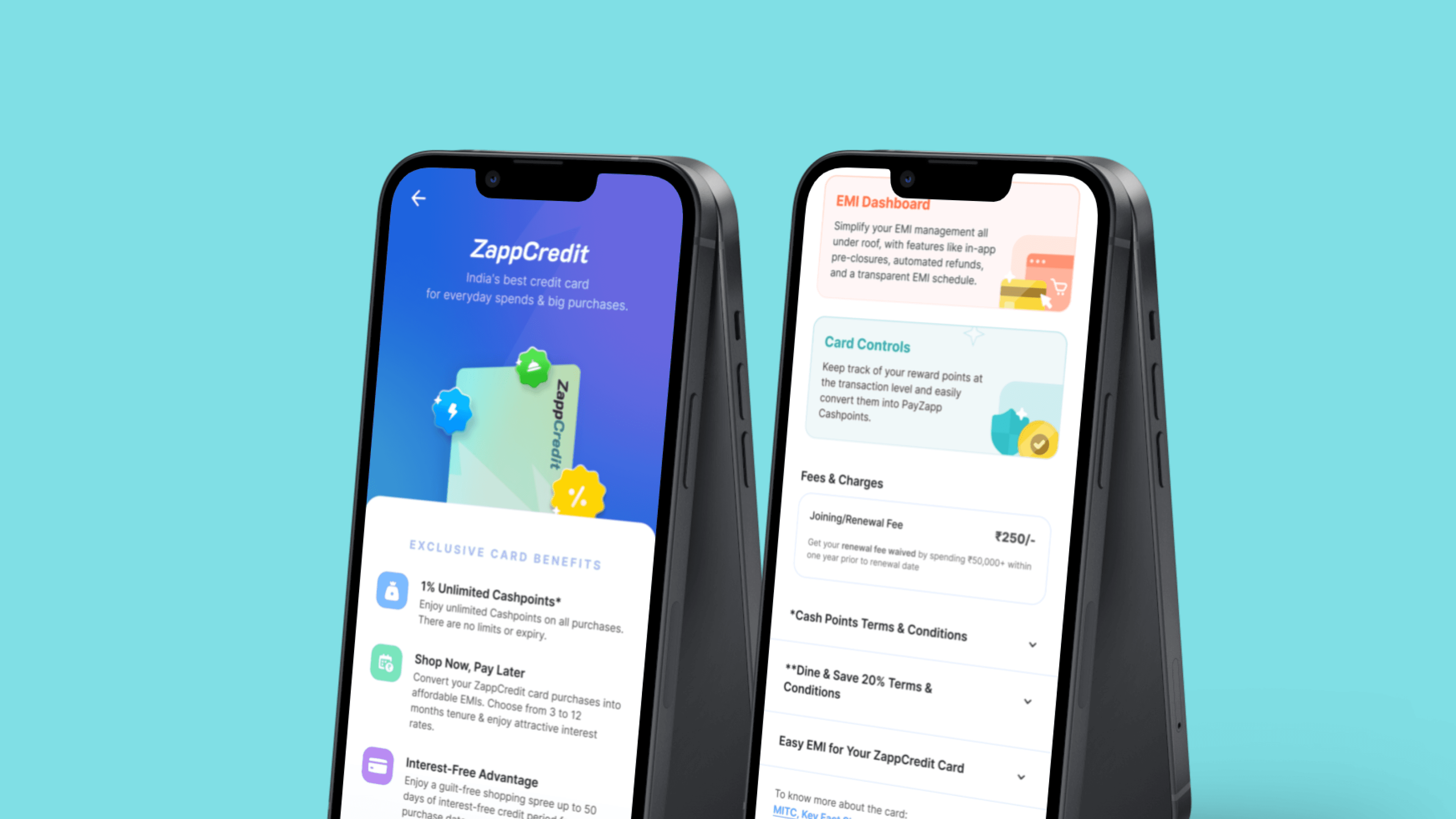
In order to effectively present the features of ZappCredit to users in an informative manner, we dedicated significant effort to this task. This presentation is an integral part of PayZapp, and we recognized the importance of making it stand out.
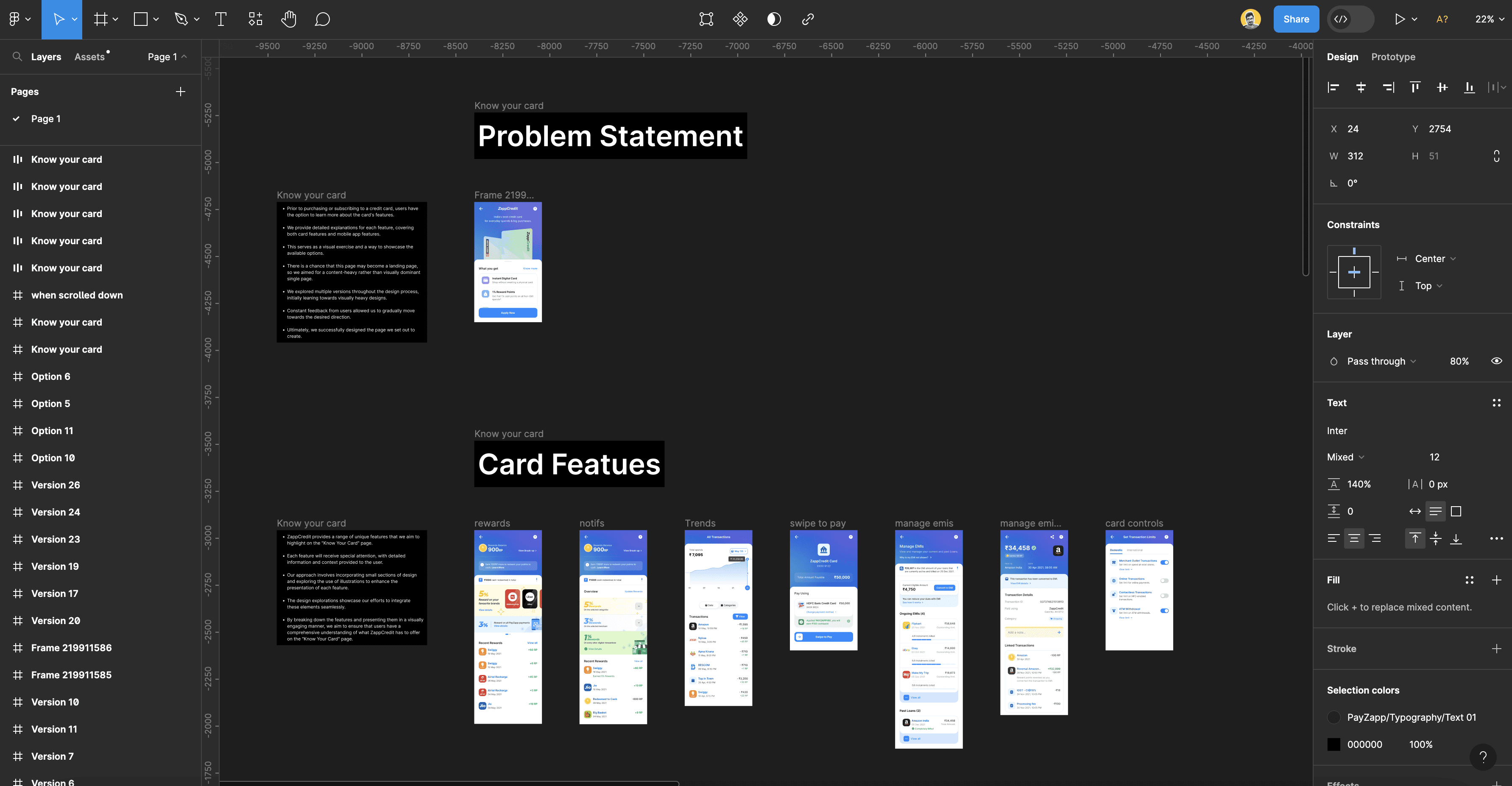
Through numerous iterations, we aimed to ensure that our message resonates with users and successfully conveys the value of ZappCredit. For a more in-depth exploration of our designs, please refer to the Figma link provided below.
Figma link ZappCredit Card

Prior to purchasing or subscribing to a credit card, users have the option to learn more about the card's features.
We provide detailed explanations for each feature, covering both card features and mobile app features.
This serves as a visual exercise and a way to showcase the available options.
There is a chance that this page may become a landing page, so we aimed for a content-heavy rather than visually dominant single page.
We explored multiple versions throughout the design process, initially leaning towards visually heavy designs.
Constant feedback from users allowed us to gradually move towards the desired direction.Ultimately, we successfully designed the page we set out to create.
Explorations:
We underwent numerous iterations to find the right direction for conveying the breadth of possibilities offered by the ZappCredit card.
Initially, our designs leaned towards a visually heavy approach, incorporating mockups of real-time app screens to showcase different usage scenarios.
Gradually, we transitioned towards a more content-centric page, moving away from the appearance of a startup landing page.
The features were divided into two categories: card features and mobile app features.
The terms and conditions section was given its own dedicated space to ensure clarity and transparency.
A special emphasis was placed on highlighting the fees and charges section, offering it a separate and prominent position.
Figma link ZappCredit Card
continue reading
Made with love ❤️ in Framer.


